Data Exploration
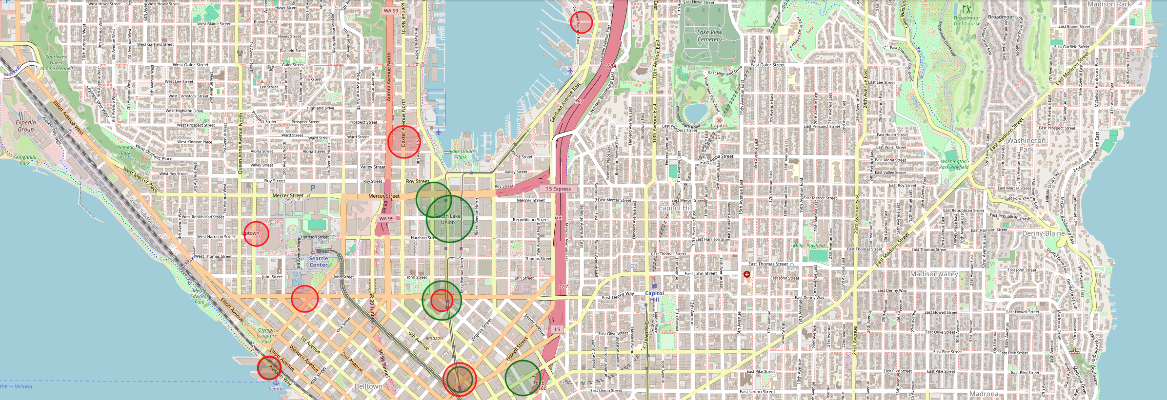

Table of Contents

Introduction
Welcome to the video tutorial for the AI Starter Kit on data exploration. In this first video,
we will discuss why data exploration is the first step in answering any data science question.
Before starting to use complex algorithms to solve a data science problem, you need to gain a thorough understanding of the corresponding data and the underlying business challenge you are trying to address. Data exploration is the process through which you gain such an understanding. This will eventually enable you to derive viable working hypotheses related to the problem at hand, which is useful for the further analysis and modelling of the data.
Throughout this process you will be faced with different types of variables, for example numerical or categorical, which require different types of treatment. In addition, looking at individual variables in isolation is not sufficient, as this does not consider the, often complex, interactions between different variables. Furthermore, you will need to identify which are the relevant variables in your dataset and, on the other hand, which ones worsen its outcome rather than improving the quality of your analysis. Finally, data exploration will help you to point out which data quality issues your dataset may have and which actions you should undertake to mitigate them.
Amongst others, data exploration is useful to identify usual and unusual values for a variable but also, to study the evolution of a variable over time. It can be helpful to uncover significant relationships between different variables or to assess data quality and suitability.
The goal behind this Starter Kit is to lay out a series of analyses that will teach you how to explore individual variables, look at how pairs of variables are related and study the complex interactions between groups of variables. You will learn how to conduct a quantitative and visual inspection of your dataset and you will be prepared for the next step in your advanced analytics workflow.
In the tutorial of this AI Starter Kit, we follow a systematic approach to explore a dataset, based on the number of variables under consideration. We start by exploring individual variables in isolation, which is the simplest form of analysis and is called univariate analysis. We continue by studying pairs of variables, which is called bivariate analysis. And finally, we study the relationship between several variables, called multivariate analysis before we conclude on our findings. But before diving into this, in the next video, we will first introduce you to the dataset that we will use in this analysis and perform some basic preprocessing on it.
Data Understanding and Preprocessing
Welcome to the second tutorial video of the AI starterkit on data exploration. In this video, we will introduce the data that will be used throughout the tutorial and explain how to preprocess your data before you can start with the statistical exploration.
Throughout the tutorial, we will explore the datasets shared by Pronto, Seattle’s bike sharing system. On the one hand, Pronto provides information about the single stations where you can take a bike. On the other hand, information about the single trips themselves are shared in an anonymized way. While we will have a brief look at the location data, the focus in this tutorial is on the trip data.
Now, let’s have a look at the data sets.
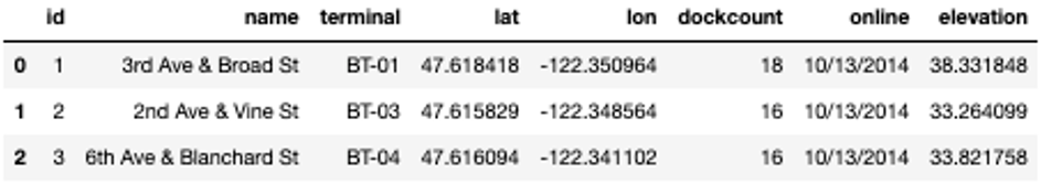
We can see, that - besides the pure geolocation data given by latitude and longitude – quite some information is shared about the single stations. Each station can be uniquely identified either by its id, its name, defined by the street intersection where the station is located and more technically, by its terminal name. We also have details on the size of the station, given by the number of docks available and when the station was put in service, given by the variable “online”. Finally, we also know about the station’s elevation from sea level.
With the geo-coordinates given, we can put the single stations on a map - probably the easiest way for humans to understand where the stations are located. From the map, we deduct that - location-wise - there are two groups of stations in Seattle.
One is located in the University district, while the other is located downtown and in its surroundings for example around Capitol Hill.
Now that we know where the single stations are based, let’s have a look at the trips data in order to understand how the single trips can be linked to actual movements throughout Seattle.
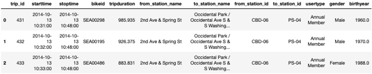
Even though the trip data is anonymized, still quite some information is given. For each trip, given by a unique “trip id”, we know when and from where the trip started and where and when the bike was returned. The resulting trip duration is given in seconds. Further, every bike in use has a unique “bike id” such that we can also follow a single bike. Additionally, we learn something about the single bike users. We know whether it either was an Annual Member having a ride or a Short-Term Pass Holder with a ticket for 1 or 3 days. On top of that, the gender and year of birth of the bike user is shared.
In order to make it possible to also place the single trips on a map later-on, we merge the geographical information namely latitude, longitude, and elevation from the stations with the information of the single trips.
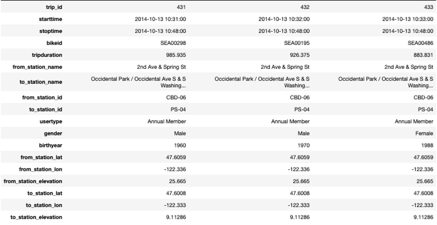
Note that we need to execute two merge commands: A first one for the departure station and a second one for the arrival station. An excerpt of the merged data that we will use in the rest of this Starter Kit is shown in the table on the right. For reasons of readability, we show the data here in a transposed manner such that each column provides the information for one single trip.
Before proceeding with the further exploration, we first check the completeness of the data, hence where we observe missing values.
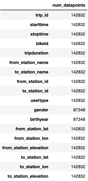
We can see that at most more than 140,000 entries are given. Most variables seem to be complete, except gender and birthyear, which only contain about 87,000 entries. The reason for this is that Short-Term Pass Holders do not need to specify their age and gender, due to which this information is just missing in the data. This can be confirmed by calculating the percentage of data present for these two variables for the single user types.
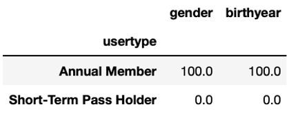
While for all Annual Members, gender and birthyear are given, it is not known for any of the Short-Term Pass Holders. For our later analysis we want to replace the missing values with meaningful entries. In order to see how to replace them, we first have a look at the existing values.
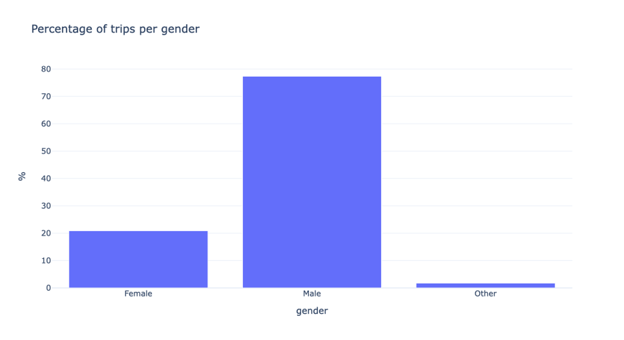
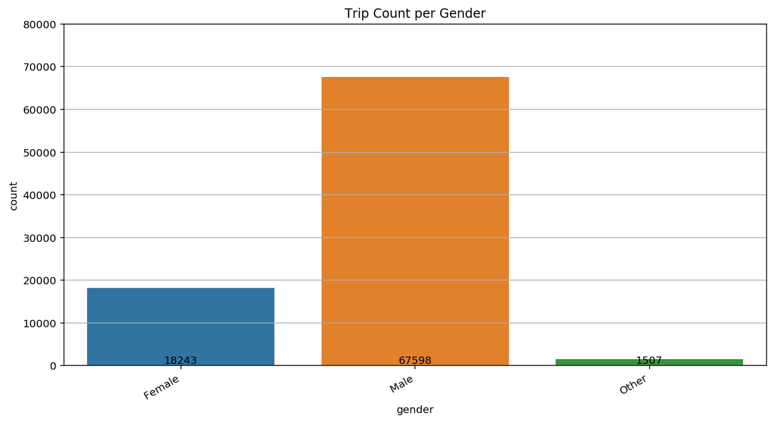
For the Annual Pass Members, three different gender options are available: Female, Male, and Other. In order to be able to distinguish the missing values from the remaining ones later-on, we replace them by “Unknown”. Interesting is the fact that almost 80% of all users are male. We will get back to this in the following video.
In order to further prepare the data for subsequent analysis, we perform the following actions: First, we convert the variable tripduration which is currently given as a float variable, to a datetime.timedelta object and store it as new variable tripdurationTimeDelta. Further, we add a new variable tripdurationMinutes indicating the duration of a trip in minutes which we keep as a float value.
For further analysis, it can be convenient to work with age instead of year of birth. Therefore, we convert the variable birthyear to an integer and create a new variable age. Finally, we extract from the starttime variable the month, the day of the week and the hour of the day, and use the starttime variable to index the data.
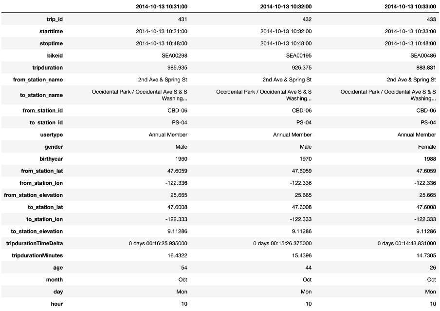
The table presents an excerpt of the dataset after these transformations. Note that also here, each column indicates one trip.
With this well-prepared dataset, we can start the actual data exploration in the next video.
Univariate Analysis
Welcome to the third video on data exploration. In this one, we will concentrate on the univariate analysis of the given data of the Pronto bike-sharing service.
For this, we start by investigating the different variables individually.

We know already that the dataset contains information on more than 140,000 single trips. By checking the first and last date of the trip data, we see that the information is given for exactly one year.
Additionally, we can check how many single bikes and stations are given in the dataset. With more than 480 bikes at over 50 stations, we expect diverse riding behaviour with interesting inter-dependencies.
As a first analysis, we concentrate on the single trip durations because the trip duration directly affects bike availability and the type of service that can be provided by Pronto.
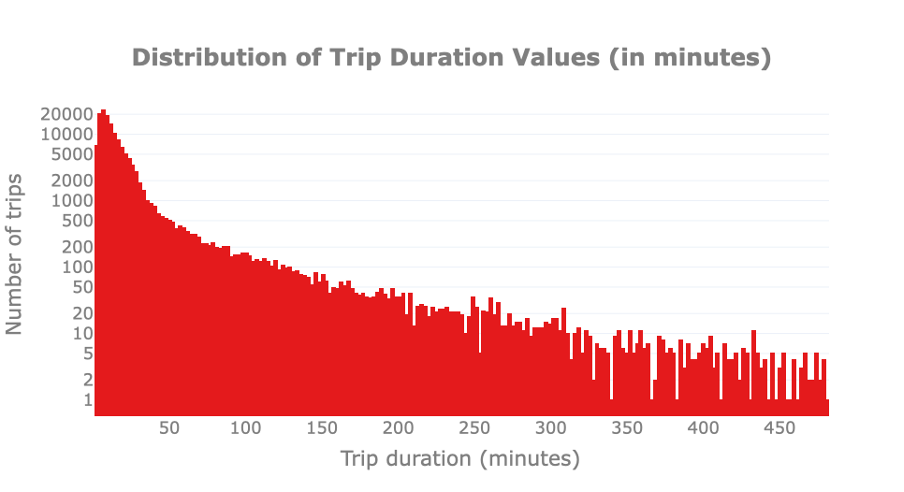
First, we visually check whether there are outliers in trip duration. For this, we plot the distribution of trip durations to spot trips that are much shorter or longer than the remaining ones. Please note that the y-axis is reported in logarithmic scale to improve the readability of the graph.
We observe that bike usage can vary from a few minutes to 480 minutes, or 8h. The latter is probably a limitation due to the service hours of the Pronto service, that is, the maximum amount of time that a bike can be rented during one single day. By just looking at the distribution we cannot notice any anomaly.
In a second step, we have a look at the users’ age as we assume that it influences the bike usage behaviour for example due to health and working status. Consequently, it is relevant to explore the typical users’ age. Similarly to the previous analysis, we analyse the age distribution to spot outliers and let potentially interesting insights emerge.
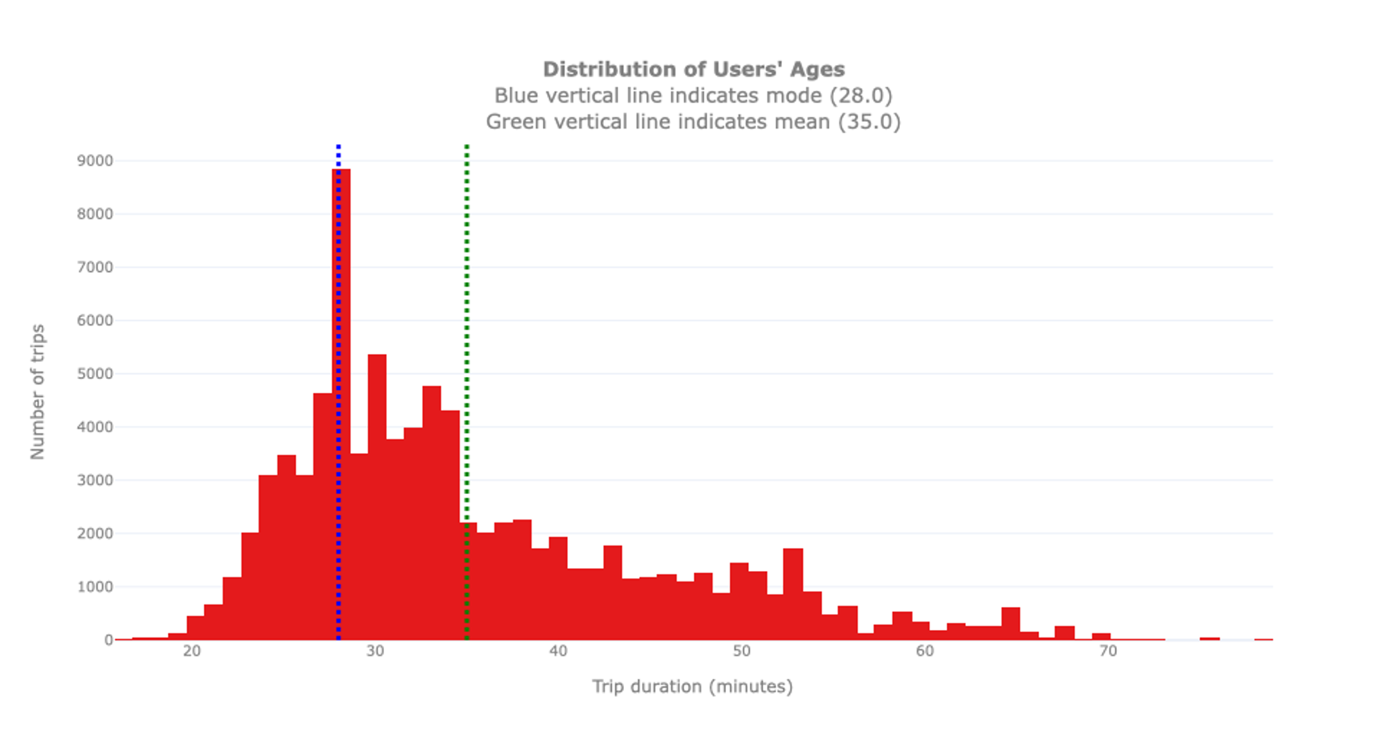
We see that the youngest user is 16 years old, the oldest one 79. As indicated before, please note that these are only the subscribed users. It is possible that younger or older people use the bikes as well but are Short-Term Pass Holders for which no specific information is available. The biggest group of users is 28 years old, hence the mode of the distribution, while the average age is 35. Interestingly, we can notice that the distribution of the ages is not as smooth as expected: An unexpectedly high number of users is 28 years old. To inspect this anomaly, we proceed with an analysis of the birth years.
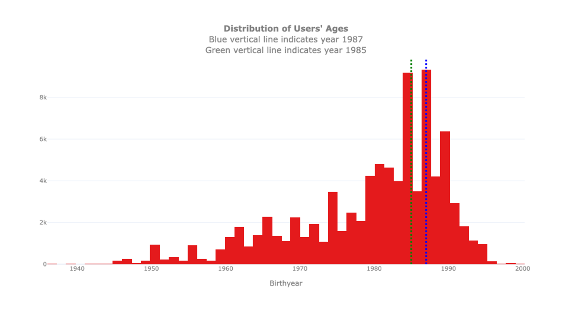
By additionally looking at this distribution, we discover that the anomaly may depend on the users’ declared birth year. The histogram indicates that bike rental seems to be quite common for users born in 1985 and 1987, but not for those born in 1986. It is unlikely that these peaks come from a ‘baby-boom’ in the Seattle area in these specific years. This may depend on a limited number of users born in those years which intensively used the service during the year for example, for a sports club with frequent commuters or a reoccurring city trip organized by some youth association. Unfortunately, the data does not include this type of information. In case you want to dig deeper into this anomaly, you could further analyse whether there are bikes that are frequently moving back and forth from or to the same locations in the same period of time for users that were born in 1985 and 1987. But this is beyond the scope of the univariate exploration.
As already discussed in the former video, we also have a look at the gender distribution. Also in this case, we should note that we do not have the identity of the users of each ride. Consequently, we cannot exclude that this bar plot is biased by a limited number of men that used the service with an annual pass while more women use short-term passes. Nevertheless, it is a trend that is observed in many Western cities and is often linked to narrow and sometimes dangerous biking lanes.
Finally, we have a look at the single locations where a bike was rented. The Pronto rental service relies on bike availability at each station. For this reason, it is interesting to explore how bikers used these stations and whether some stations are more popular than others.
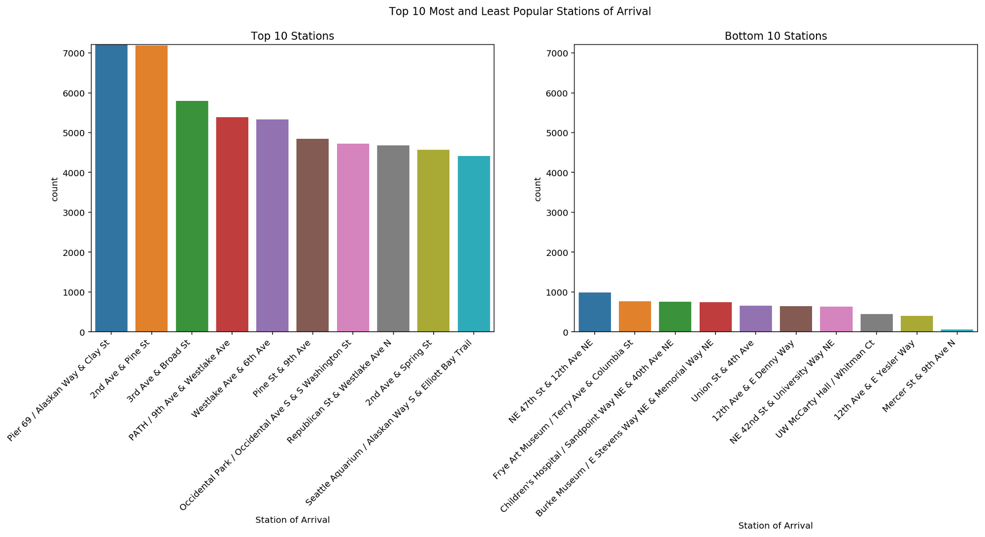
The bar plots shown here provide the top 10 most and least popular stations of arrival. As you can observe, there is a big difference in terms of trips toward these stations. This can lead to unbalanced stations, where extra bikes need to be continuously moved toward stations with missing bikes. This aspect will be further inspected later on in the tutorial.
From this univariate analysis we already learnt several things about the biking - or at least the subscription – behaviour in Seattle. We know already that the average subscriber is male, around 30 and enjoys going to Pear 69.
In the next video, we will expand our analysis to bivariate analysis in order to better understand how two variables influence each other.
Bivariate Analysis
Welcome to the tutorial video on bivariate analysis of the AI Starter Kit on data exploration. In this video we explore the relationships between the variables analysed in the previous videos. Our main focus is on the factors that may have an influence on the number of trips and their duration.
As a starting point, let’s inspect how bikes are used through the different days of the week.
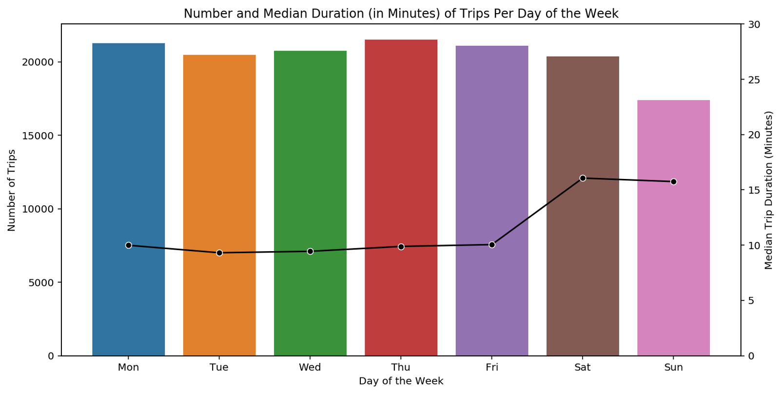
For this, we have a look at a bar plot where the bars represent the number of trips performed on the different days of the week. On top of the bar plot, we plot a line that depicts the median duration of trips for which the scale is given on the right-hand side. The bar plot shows that there are slightly less trips in the weekend, but that they tend to last longer than during weekdays. Across the single weekdays, the number of trips is similar. From this, we can draw the following hypothesis: On the one hand, we have leisure bikers who use the bike recreationally essentially during the weekend. On the other hand, we have weekday users who use the bike for commuting to work with comparably short trips of around 10 minutes.
Let’s try to validate the previous hypothesis by looking at the number of trips per hour, distinguishing between weekdays and weekends.
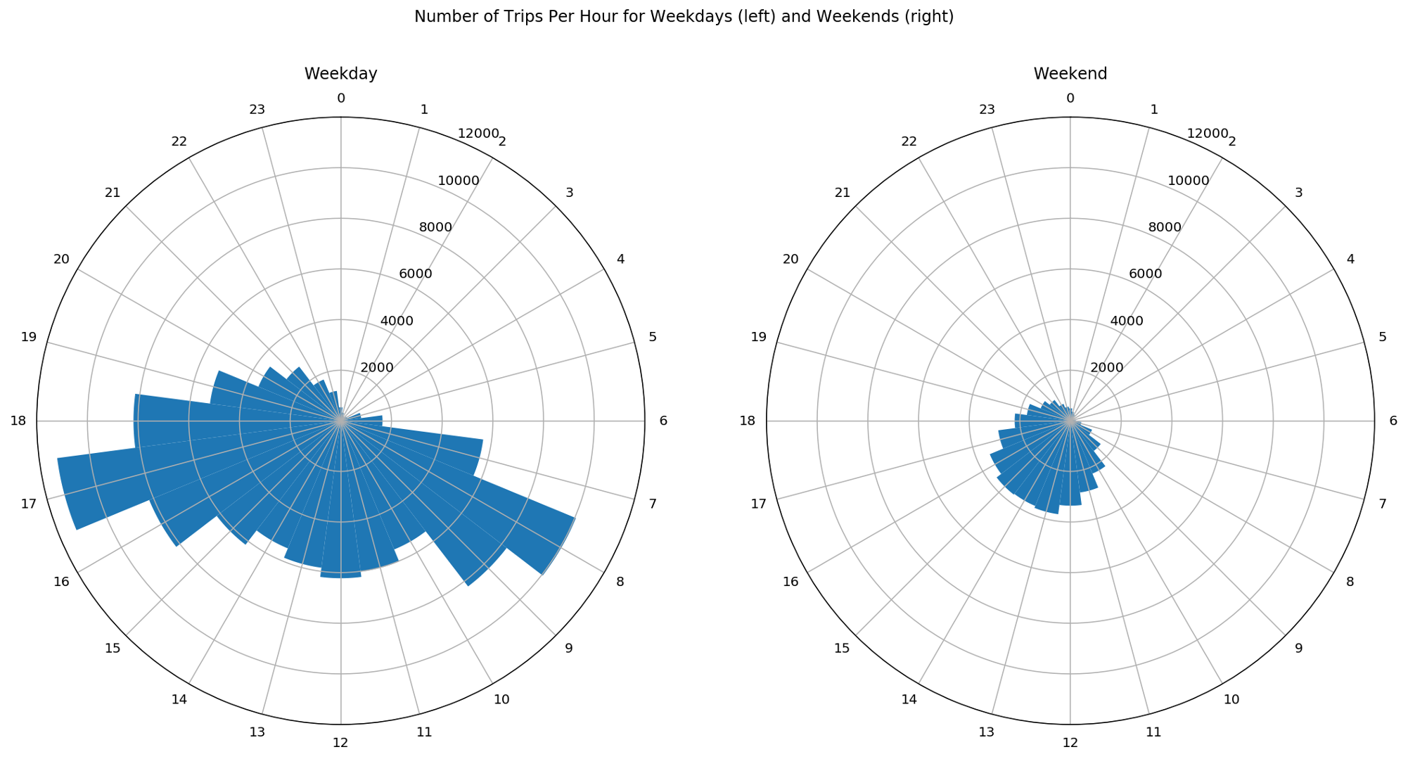
In this figure, we see the number of trips for weekdays on the left-hand side and for weekends on the right-hand side. The angular position in the circles represents the hour of the day while the blue bars show the number of trips for each hour. As weekends consist of two days only compared to 5 weekdays, these figures are misleading.
To have a clear visual comparison of the trips between weekdays and weekends, we need to normalize the data such that we have the number of trips per day. With this, we can avoid that wrong conclusions are drawn.
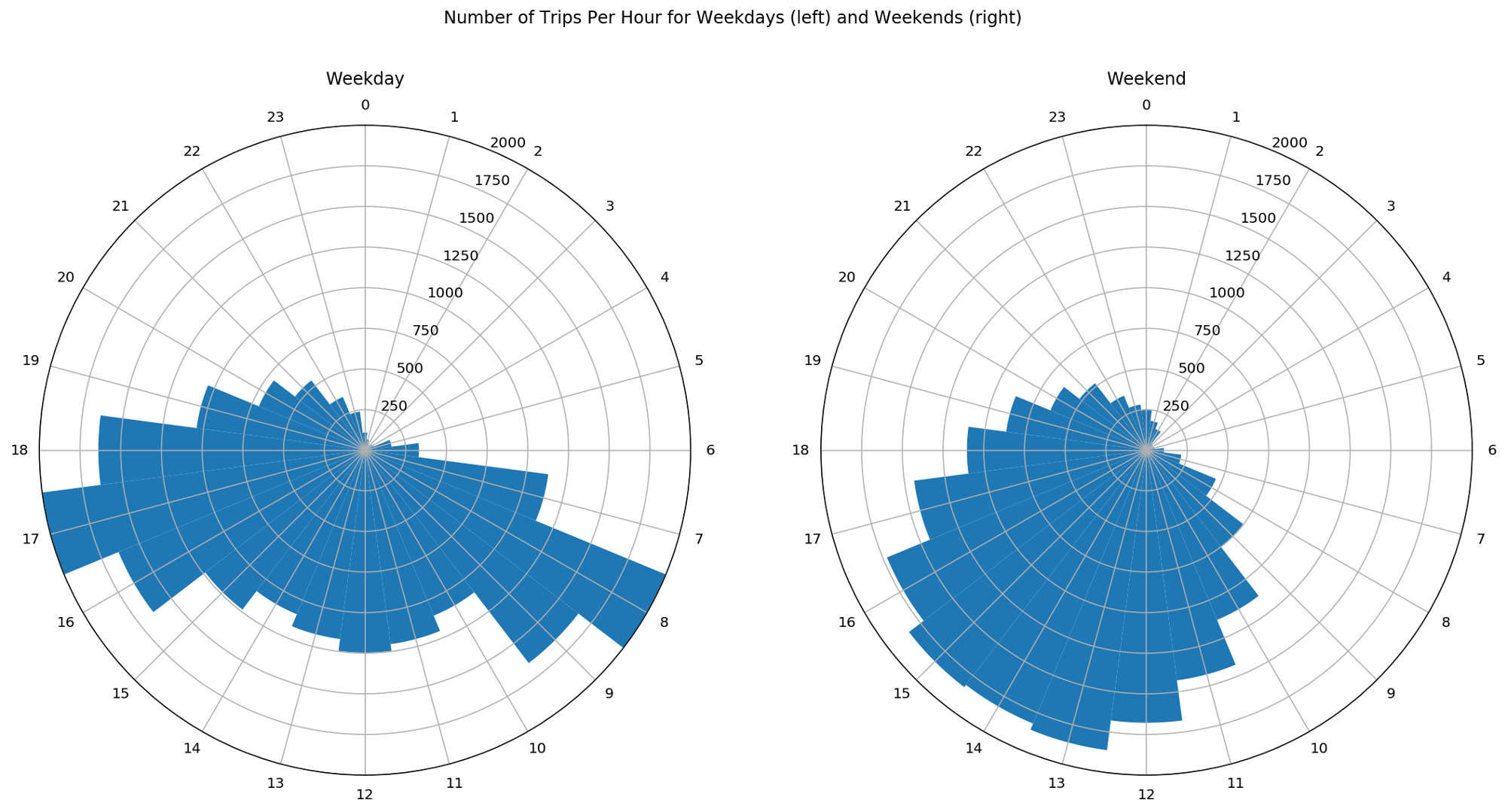
Now that the data is normalised, we clearly see two different patterns on weekdays and weekends: during weekdays, there are two peaks in the number of trips, occurring during the morning and evening rush hours while on weekends the distribution is much more uniform throughout the day or at least throughout the period comprised between the late morning and the early evening. These patterns support the hypothesis of recreational bike trips at the weekend compared to work- or school-related trips during weekdays.
We can further inspect the rush hours during weekdays to understand whether the rental locations share some similarities. As a first step, we divide the trips in two groups. On the one hand morning rush hours for which we select trips done on weekdays during 7 and 10 in the morning and on the other hand, evening rush hours with trips done on weekdays during 4 in the afternoon and 7 in the evening. Furthermore, for both groups we only retain the top 10 stations of arrival.
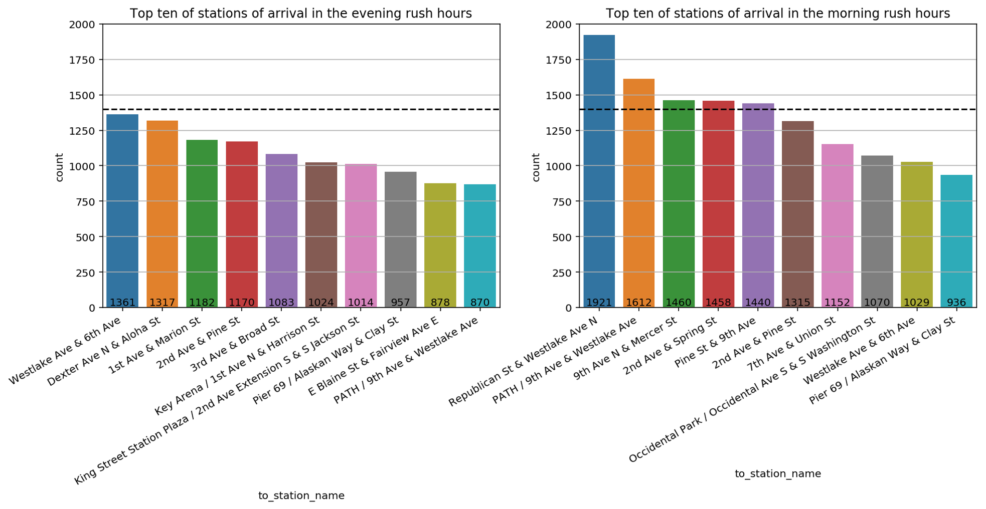
The resulting data is shown in this bar plot with the morning rush hour on the right- and the evening hours on the left-hand side. The y-axis describes how many times a given station was reached. A dashed horizontal line at 1400 is drawn to ease the comparison between the bar plots.
By comparing these bar plots, we discover that there are more stations of arrival that count more 1400 visits in morning rush hours than in the evening rush hours. This may indicate that bikers tend to converge in the morning rush hours toward a limited number of stations, like for example close to working places or schools, whereas in the evening rush hours bikers go in different directions like different residential areas. This hypothesis can also justify why stations that are quite popular in the morning rush hours such as Republican Street & Westlake Avenue North or 9th Avenue North & Mercer Street do not appear in the top ten stations of arrival in the evening rush hours and vice versa for Dexter Avenue North & Aloha Street or 1st Avenue & Marion Street. To further compare the difference between stations of arrival in the morning and evening hours, we plot them on the map of Seattle.
The green circles indicate stations that were reached in the morning rush hours while the red circles indicate those stations that were reached in the evening rush hours. The size of each circle is proportional to the number of times that the station was reached. What can we learn from this? First of all, in the area of South Lake Union - just below Lake Union - there are green stations but no red stations. This may mean that this location is more commonly reached by working bikers. Further, the green ones seem to be more ‘condensed’ in the downtown area when compared to the red stations. This may be due to the fact that red stations are reached after working hours. Part of the bikers may decide from 4 to 6 in the afternoon to go back home in more residential areas. Interestingly, none of the top 10 stations is located in the University district. This can have different reasons: Most obviously, students don’t bike to university, maybe because they live close by. Another reason might be that lecture hours are not exactly the same as working hours and finally, the number of non-students is simply bigger than the number of students.
Another influence on the biking behaviour is surely the weather. Even though, we don’t have the weather explicitly given in this tutorial, we know that the chance of rain and cold temperatures in a state like Washington is much higher in the winter months compared to the summer months.
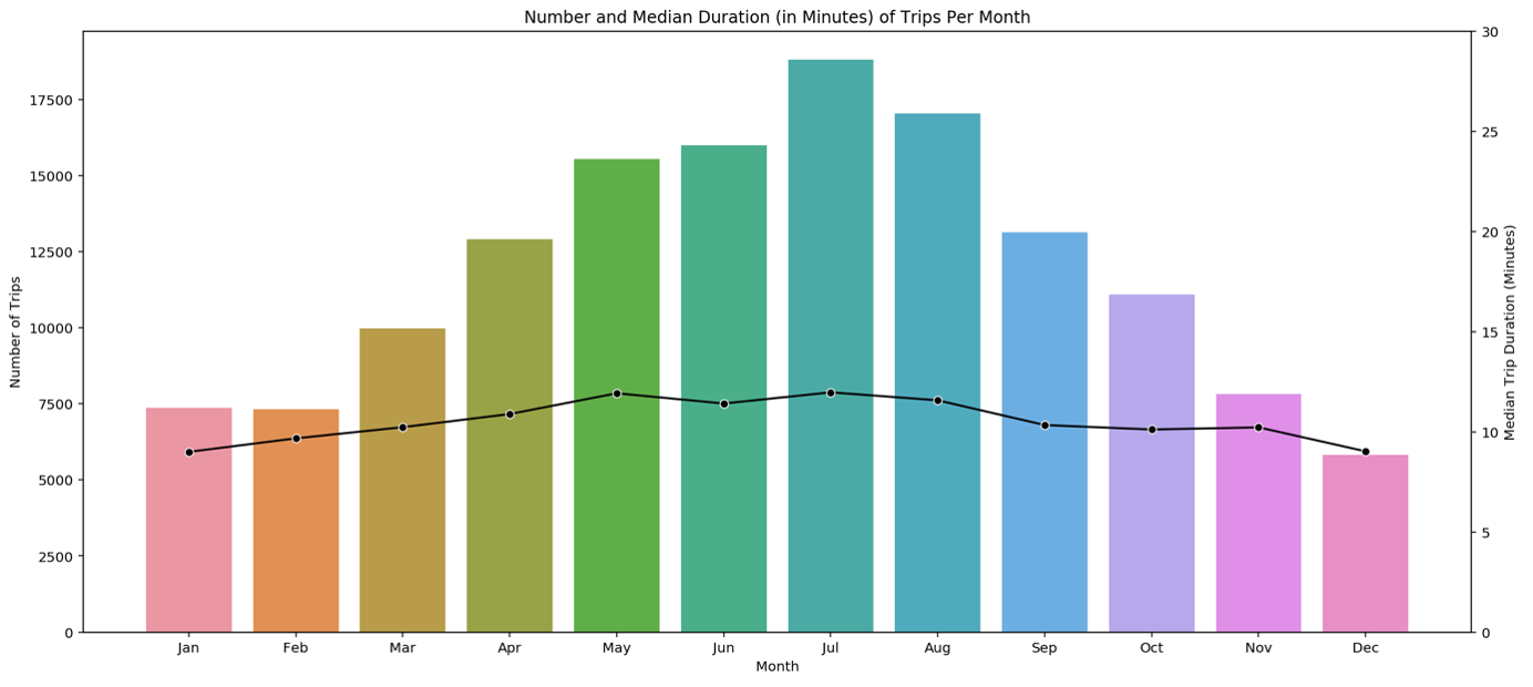
For this reason, it is enough to plot the number of trips against the months. The resulting pattern is as expected: More than double as many bikes are used in summer compared to winter. The most-frequented month is July. Interestingly, the mean trip duration given by the black line is more or less constant during the year.
Let’s see whether on the other hand the trip duration is influenced by the age of a biker.
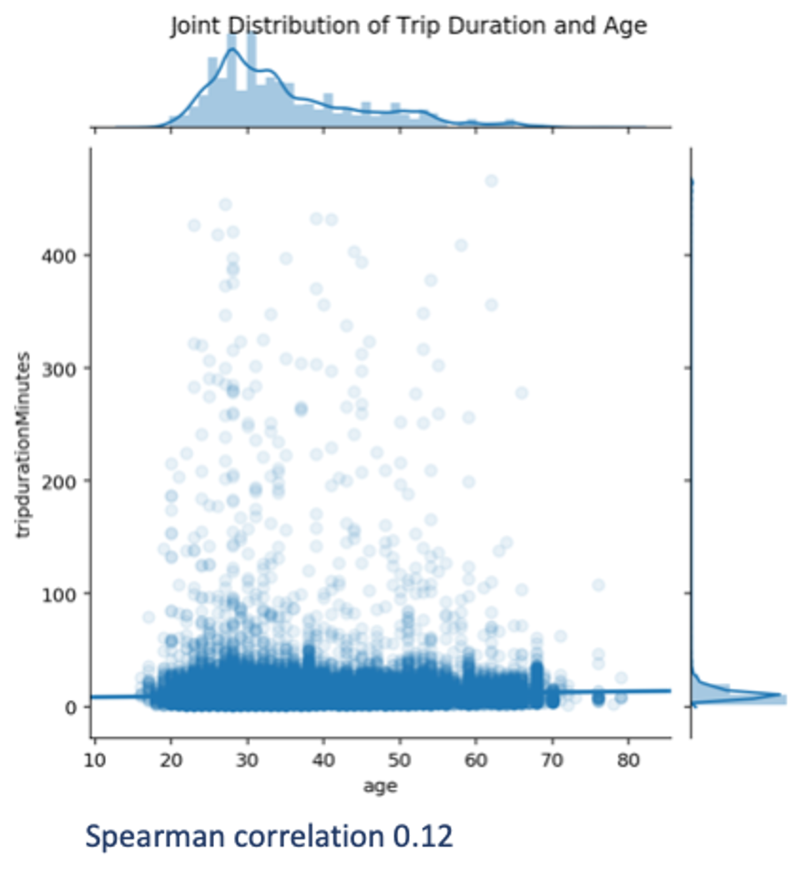
For this purpose, we visualise the joint distribution of these two variables by means of a scatterplot and compute their Spearman’s correlation. This correlation is chosen to measure the monotonic relationship between the variables. The Spearman’s correlation is chosen in place of the Pearson’s correlation since the latter is not robust to outliers.
As we can see, there is a broad age dispersion over a relatively narrow distribution of trip durations. Longer-lasting trips occur for many ages. Not surprisingly, the Spearman’s correlation is close to zero, hence the age does not seem to play an important role in the duration of trips. Note that driving speed might also play a role, but as we only know where each trip started and ended, we cannot estimate the speed, and hence no further analysis can be done.
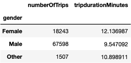
Another factor that could influence the trip duration is gender. As we can see, women bike longer with an average duration of about 12 minutes per trip compared to men with an average duration close to 10 minutes per trip. The fact that mean duration of the Unknown group is much longer - namely 36 minutes – suggests that short-term users do not use the bikes for commuting, but rather for leisure purposes.
Additionally, we can have a look at the relationship between gender and age. In the univariate analysis, we highlighted a peak at 28 years. In the present analysis, we can further investigate it by seeing whether or not it is consistent across genders.
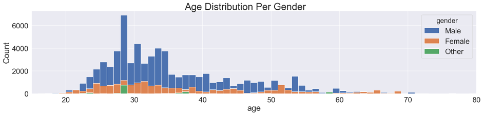
We can see that the age distribution is relatively similar between men and women, with a more prominent bike usage around 30 years compared to younger and older ages. The peak at 28 years only clearly stands out for men and Other and remains difficult to interpret.
Another relation that can support our hypothesis on commuters is given by the weekday of the trip and the type of user. Bike users can be distinguished based on the fact that they have an Annual Membership or a Short-Term Pass.
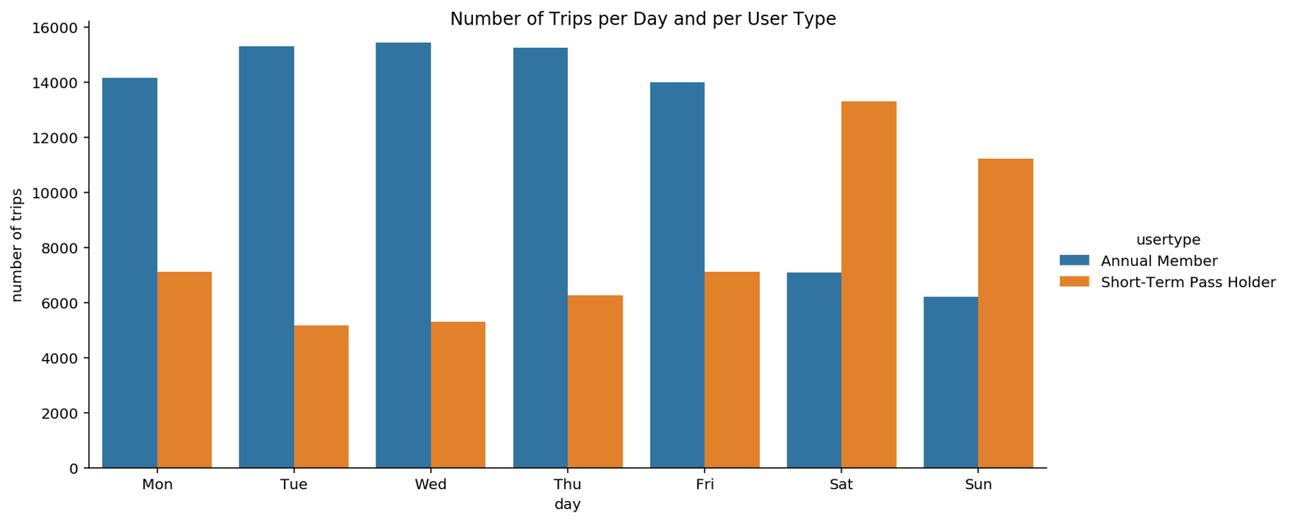
We notice that Short-Term Pass users are more frequently riding a bike on weekends and much less on weekdays, as opposed to annual members. This suggests that Pronto’s choice of offering two types of subscriptions meets the needs of these two types of users. This supports the hypothesis that leisure bikers may often subscribe to a Short-Term Pass whereas bikers with an annual membership are probably commuters that need a bike for commuting to work.
From the univariate analysis we know that the bike-sharing service is more often used by men than by women. Here we explore how this usage is over the days of the week.
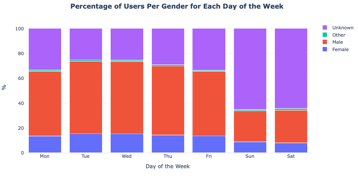
In the plot we see that there is no obvious difference in the gender ratio. The most noteworthy difference is the increase of the Unknown gender category over the weekend. As we already saw, this can be explained by the fact that this group represents Short-Term Pass holders, which travel mostly on weekends.
It is possible that there is a relationship between a biker’s gender and the location where the biker is going. For this, we analyse whether there exist stations of arrival that are more popular for one gender than for the others. To this end, we split the trips according to gender. For each group, we compute how frequently each station was reached. Finally, for each station, we compute the ratio between the frequency of arrival for men and women. More specifically, we define the two following ratios: the ratio between the visit frequency for women compared to men and the inverse, namely, the ratio between the visit frequency for men compared to women.
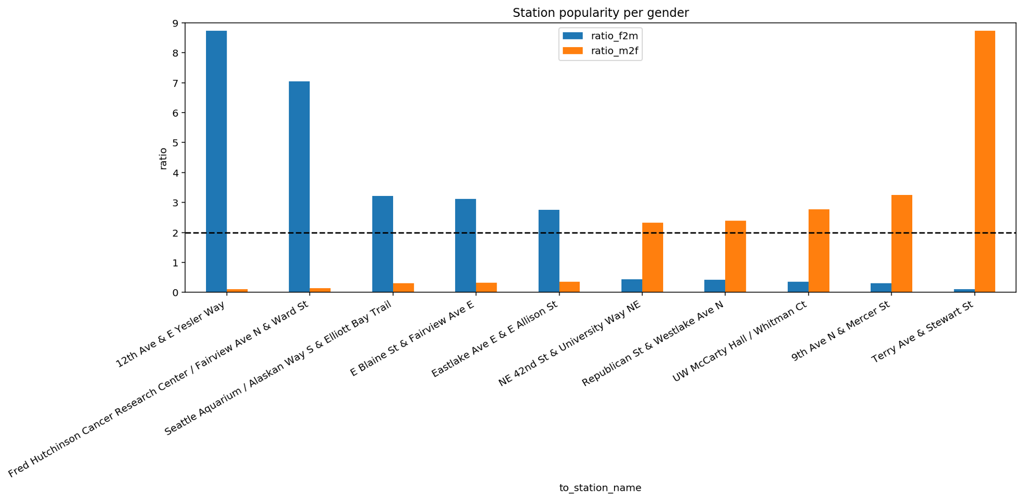
This bar plot reports the top 5 and bottom 5 stations with the highest difference in ratio. If we focus our attention on the dashed line we can see that the top 5 stations for women are at least twice as popular among women than among men. This popularity is quite striking especially for the first two stations on the left. Similar considerations are valid for the bottom 5 stations that are more popular among men than among women. The existence of such gender-related bias in the reached destinations is interesting to explore since it allows to make further assumptions on how city services or workplaces are organized in Seattle. These aspects will be investigated in the next video during the multivariate analysis.
From the univariate analysis we already know that some stations are more popular than others in terms of arrivals. Now, we further inspect this aspect by checking for each station how many bikes arrive and depart. This analysis is important to identify unbalanced stations, namely stations that Pronto needs to take special care of when redistributing bikes among stations.
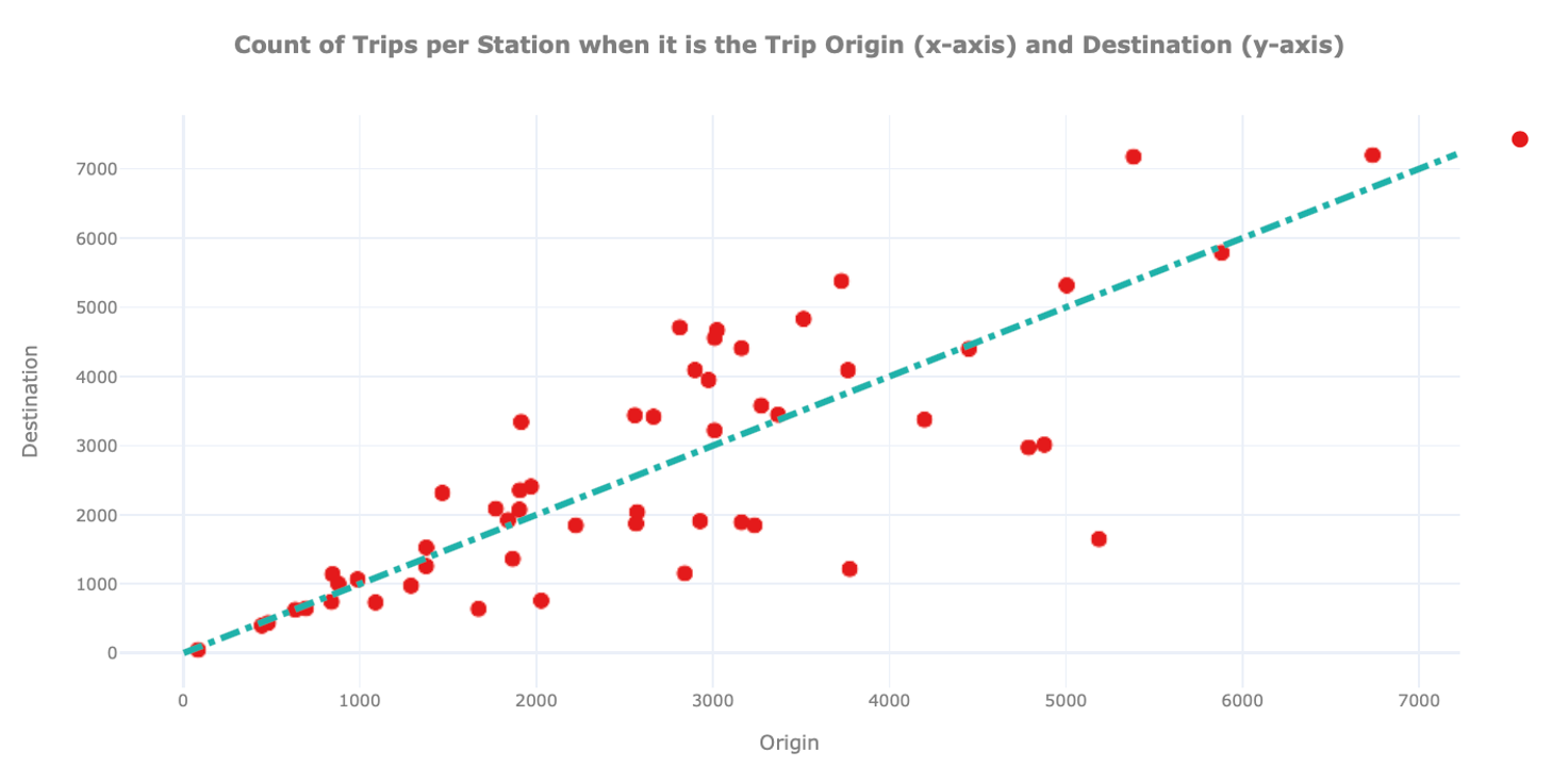
In this plot we show for each station on the x-axis how many times it was the origin and on the y-axis how often it was the destination of a trip. We also include a dashed straight line to easily identify hub stations where the number of arrivals and departures is similar.
We can observe the existence of unbalanced stations, namely stations that are depicted far away from the diagonal. A station can be unbalanced because many users pick up bikes from there, but few drop them off, or vice versa. From the graph above it is hard to extract further information on these stations. For this reason, we mark on the map of Seattle where these stations are located. To spot insights related to unbalanced stations, we draw stations using different colours and sizes: the green circles show unbalanced stations with more arrivals than departures. The red circles show unbalanced stations with more departures than arrivals. For both holds, the bigger its size, the higher the unbalance.
To ease the visualisation, we only plot the top 10 (unbalanced) stations.
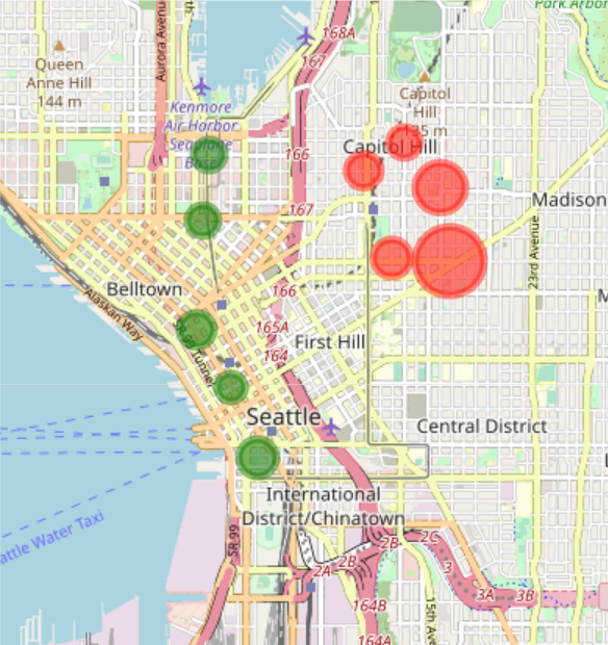
As we can see on the map, the unbalanced stations with highest amount of departures - hence the red circles – are all located on Capitol Hill while the unbalanced stations with highest amount of arrivals - the green circles - are all located downtown. This last finding opens another possible explanation to justify why there are many stations of arrival downtown: bikers may be more prone to use bikes to move downhill. To explore this hypothesis, we again plot the unbalanced stations but now using the elevation from the sea level for the size of the circle.
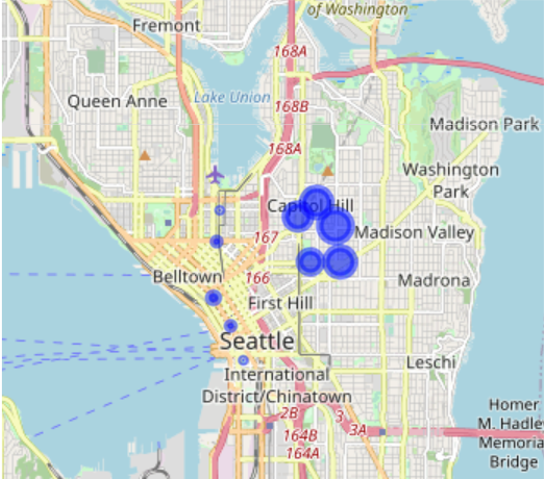
Comparing this map to the one before, we can confirm our hypothesis, namely that unbalanced stations with more departures than arrivals are the ones located uphill while unbalanced stations with more arrivals than departures are the ones located downhill. This observation provides useful insights for the Pronto system. Indeed, in case of the opening of new stations, we can already foresee whether the station would be unbalanced or not and take this into account for handling the logistics.
With this bivariate analysis, we learnt a lot about the users’ behaviour. In the next video, we will go one step further and perform a multivariate analysis hence take more than two variables into account to find relations between them.
Multivariate Analysis
Welcome to the fourth tutorial video on data exploration. In the former videos, we concentrated on uni- and bivariate analysis. In this video, we conclude the exploration of the bike-sharing dataset with a more sophisticated multivariate analysis, complementing the analyses presented before.
At the end of the last video, we validated that the elevation plays a major role in explaining why some stations are unbalanced with respect to arrivals and departures. In other terms, the elevation embodies the ‘cost’ that a user has to face when moving between stations that are at different levels. This aspect, that is the cost of reaching nodes within a network, is a general problem that is faced in network analysis for identifying the best routing. For this reason, we continue the previous analysis by focusing on the ‘cost’ of reaching stations without the need of using the elevation explicitly. By making this problem more generic, the proposed analysis can be applied also to other networks where there are ‘costs’ for traveling between nodes which influence routing. We redefine hence the previous problem setting as follows: each bike station represents a node of a network and each node is connected through an edge to all other nodes of the network. The single edges are bidirectional, and each direction has an associated cost. In our case, the cost is represented by the time required for traveling between two stations. We assume that given the same distance, the time required for moving between two stations is determined by the difference in elevation, hence, biking uphill requires more time than biking downhill. As a first step to perform this analysis, we compute the trip duration among unbalanced stations. An excerpt of these trip durations is provided in the table on the right.

The table shows the cost hence, the time it takes to reach a given node when departing from another one and vice versa. In the example, we see that the cost to go from Cal Anderson Park, 11th Avenue & Pine Street to E Harrison Street & Broadway Avenue East is less expensive than taking the return way with a time difference of less than a minute. Hence, it is slightly faster to go in one direction than in the opposite direction.
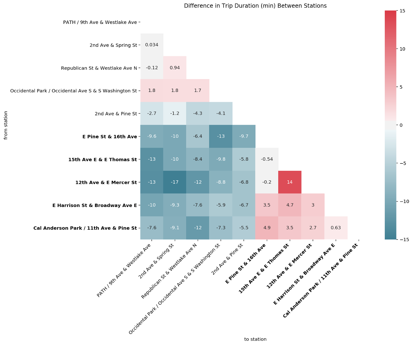
From this table, we plot a matrix depicting the difference of trip durations between each couple of unbalanced stations. The colour map indicates how much longer the median trip duration is from one station to the other, hence the higher the values, the redder the colour and as such, the bigger is the difference between the costs in the two directions. If the colour tends to a darker blue, the difference is negative such that it takes less time from station A to station B than the return way. To facilitate the visualization of the stations located in Capitol Hill, and therewith with a high elevation, the names of these stations are reported in bold letters.
We observe that the connection from 12th Avenue & E Mercer Street to 2nd Avenue & Spring Street has the largest negative difference indicated by the cell with the most intense blue colour. In addition, we can see that the first one is located in Capitol Hill while the latter is located downtown. Similarly, the connection between Cal Anderson Park, 11th Avenue & Pine Street for example, which is also located in Capitol Hill, to Republican Street & Westlake Avenue North, located downtown, also shows a large negative difference. In fact, all stations located in Capitol Hill show a significant negative difference compared to the stations located downtown. This is consistent with the previous observation that the first group of stations are located at a higher elevation than the second group. Between the stations located downtown we can observe light - positive and negative - differences, which might be due to the particular relief characteristics and traffic organization of Seattle’s downtown road network. Finally, between the stations located in Capitol Hill, we observe a slight positive difference, again likely revealing particular relief and traffic organization characteristics of that area. An exception is the large positive difference observed between 12th Avenue & E Mercer Street and 15th Avenue East & E Thomas Street. If we inspect the elevation of these two stations, we observe that there is a difference of 10m between them, which might at least partially explain their difference in trip duration as other pairs of stations exhibit a higher difference in altitude.
Another interesting fact revealed during the bivariate analysis was the relationship between gender and the stations of arrival. In this analysis we want to further explore how this relationship evolves during the week. As a first step, we take the top ten stations of arrival on weekdays during the morning rush hour. We focus on this time window since we assume that it is used by bikers to go to work. For these stations, we check whether they are more popular among men or women.
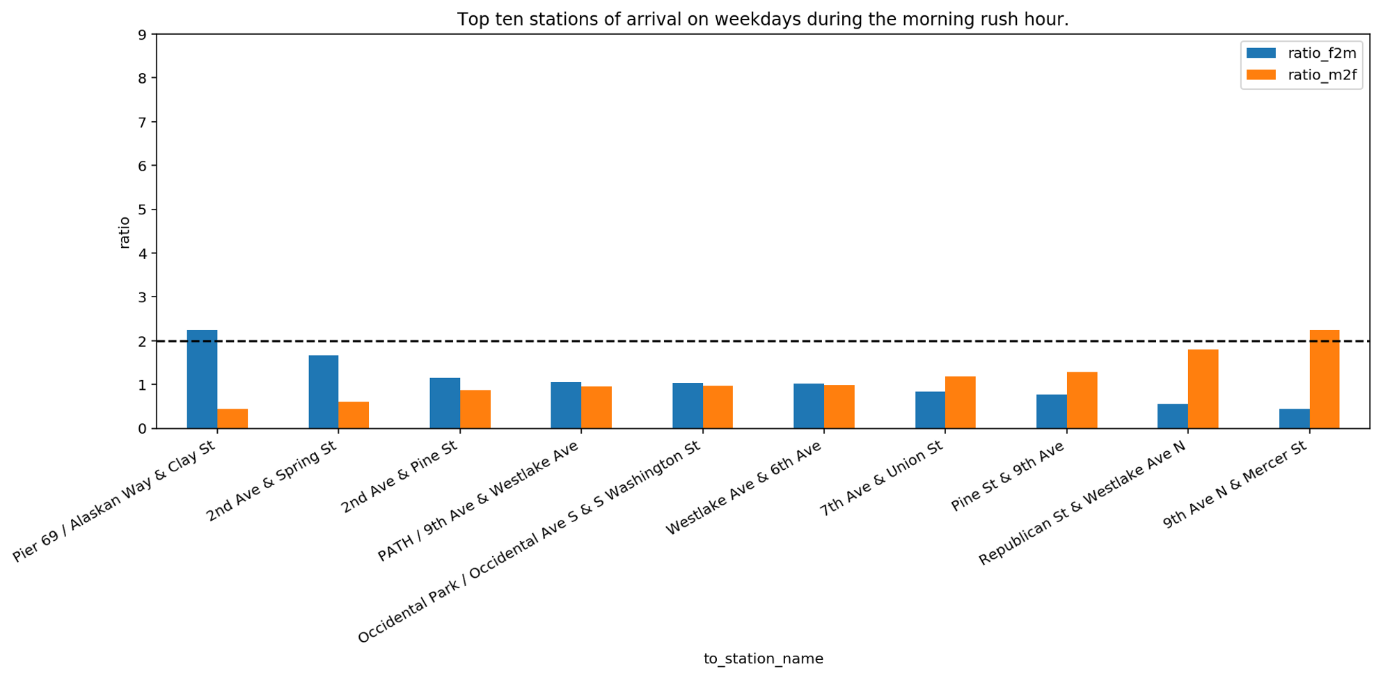
We can see that Pier 69, Alaskan Way & Clay Street is twice more popular for women than for men, whereas 9th Avenue North & Mercer Street is twice more popular for men than women. For all other stations, the difference is smaller, meaning that the popularity of a station of arrival in the morning rush hours is similar. If we compare this bar plot with the previous one in the former video we realize that the difference in ratio is significantly lower. This can signify that on weekdays, during rush hours, both men and women are going toward the same gathering places. To inspect this hypothesis, we now focus on stations of arrival during the weekend. The assumption is that during weekends bikers may go to different places than their work location, for example, to follow their personal interests and hobbies. For this reason, we use all stations of arrival that are reached on weekends. For these stations, we check whether they are more popular among men or women.
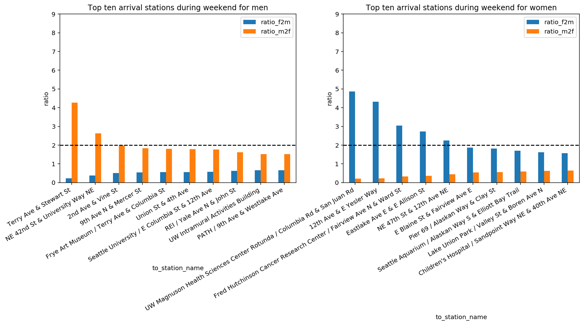
With this analysis, we discover that during the weekend men and women have different favourite stations of arrival. Moreover, if we compare the last three bar plots, we discover that the ratio of men vs women of the top stations of arrival changes during the week. Indeed, we can see that on weekends there are in total seven stations where the ratio of women to men or the ratio of men to women is above 2. During weekdays this ratio was above 2 for only two stations. This seems to imply that, in absence of constraints like the location of the working place, gender plays a role on where bikers go. We complete this analysis by plotting the previously identified stations on the map. We distinguish between the following criteria: We use blue circles for the top 10 stations which are reached in the morning rush hours during weekdays, green circles for the top 10 stations which are reached by women during weekends and red circles for the top 10 stations which are reached by men during weekends.
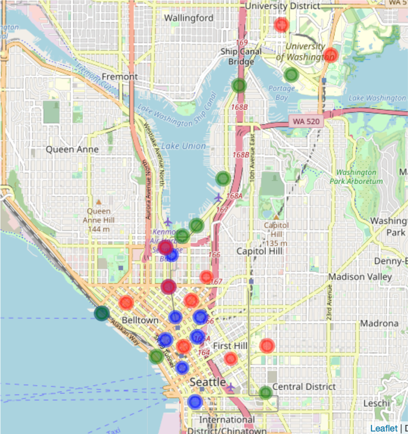
Note that red circles appear in a light red tone, close to orange while superposition of blue and red circles results in a dark red colour and superposition of green and blue circles results in a dark green colour.
The distribution of circles of different colours confirms that the popular arrival stations during weekdays do not match with the popular stations reached by men and women during weekends. Further, it confirms that there are popular locations of arrival during weekends in the University district which were not present during weekdays.
In order to further explain the differences observed during weekends, a more in-depth knowledge about the city and the shared habits of its inhabitants would be required, which falls outside the scope of this tutorial.
Key Take Away Messages
Congratulations! You completed the tutorial accompanying the AI Starter Kit on data exploration.
In this Starter Kit we have demonstrated how appropriate statistical and visualisation techniques can help a data scientist in discovering interesting patterns and gathering insights without applying any complex algorithm.
We demonstrated how to explore a dataset by starting from a univariate analysis by means of which we could already get a clear view on who Pronto’s customers are with respect to age and gender, where they like to go, and for how long the single bikes are usually in use. By subsequently adding more information and combining different variables, we were able to reveal relationships between gender and most frequently visited stations but also how the bikes are used for different purposes, like a strong commuter’s pattern during the week and recreational usage on the weekends. Finally, via a multivariate analysis, we figured out how the elevation influences the biking behaviour. By introducing a cost to the single trips, we could explain why at some stations more bike trips are started while at other stations, more bike trips end.
By applying comparably easy visualisations sometimes more insights can be gathered than by applying a sophisticated machine learning model.
We thank you for completing this video series and hope to welcome you in another AI Starter Kit tutorial.