Resource Demand Forecasting
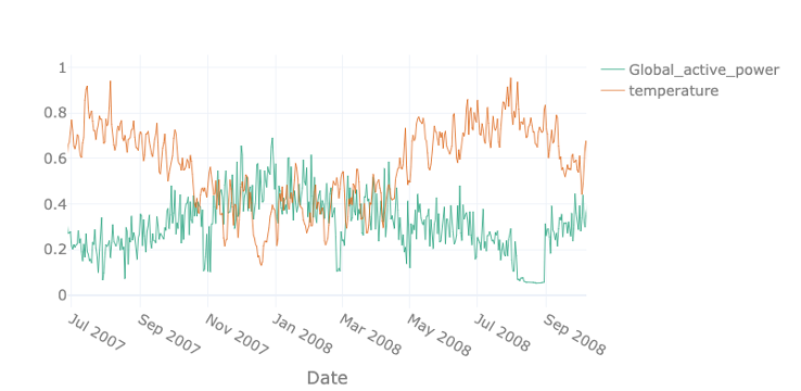

Table of Contents

Introduction
Welcome to the tutorial for the AI Starter Kit on resource demand forecasting. In this first video we will provide an overview of the actual business case we are tackling. We will introduce the most important concepts and explain why it is beneficial for resource planning to know the expected demand in the future.
Resource demand forecasting concerns accurately predicting the future need for a resource, typically using historical information. It is one of the most essential steps in resource demand management, which tries to ensure that sufficient resources are available to satisfy a fluctuating demand. Resource demand forecasting allows one to plan ahead and guarantee that sufficient resources are available when needed and to avoid costly countermeasures in case of shortage.
Precisely forecasting the demand of a given resource can be beneficial for several purposes in a wide range of industrial contexts. When knowing the future demand, only the number of resources actually required need to be allocated to a specific task or process. The field ranges from forecasting the number of products that need to be manufactured based on historical sales figures, over predicting the parking demand or traffic density in a particular neighbourhood in order to control traffic in more intelligent ways, to estimating the amount of energy that will be consumed and produced for a particular city or region.
Especially in the later field, the demand is influenced by a mixture of external factors such as the weather conditions. For energy suppliers it is more beneficial to buy electricity on the day-ahead market than on the spot market. Consequently, the more accurate the energy consumption can be predicted, the lower the cost. Given that more and more houses and appliances are enabled with a smart meter, an increasing amount of data becomes available that can enable and improve this prediction. Furthermore, these kinds of predictions also allow energy suppliers to better balance demand and supply and helps them to ensure proper grid operation, but also to avoid negative prices, for example in times of high solar irradiation.
In this example we see the active power of a single household near Paris shown in green. In orange, the outside temperature is given. The two are strongly correlated – the demand increases with decreasing temperatures since most French households use electrical heating. Therefore, particularly in winter times, the grid has to be stable when facing high demands.
In this Starter Kit, we will demonstrate how to effectively forecast the demand for this household for the future by taking external factors into account. In the following videos, we will first start by gaining some first insights in the data in front of us and perform some initial pre-processing steps to prepare the data for the analysis. Subsequently, we will illustrate you how to gain deeper insights by presenting a number of visual and statistical techniques in order to explore the data for identifying interesting patterns. In a next step, useful characteristics or features will be extracted from the dataset that can as serve as input for the forecasting models. Finally, in the last video, we will explain you how to correctly compare the performance of multiple forecasting models.
Let us go ahead with the next video on data preparation, in which we will describe how to deal with the typical problems of raw data and how to perform data fusion when multiple sources of data are available.
Data Preprocessing
Welcome to the second video of the tutorial for the AI Starter Kit on resource demand forecasting! In this video, we will detail the dataset that we will use and perform the necessary preprocessing steps in order to prepare the data for further analysis.
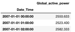
In this AI Starter Kit, we will work with a publicly available energy consumption dataset from the UCI repository. This dataset contains measurements of electric power consumption in one household, located near Paris, with a one-minute sampling rate over a period of almost 4 years. Different electrical quantities and sub-metering values are available, as you can see in the table.
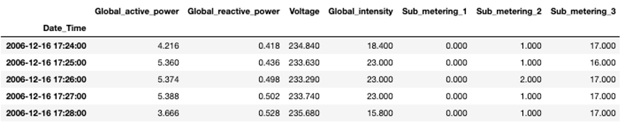
Let us first have a look at the single variables given in the table: First of all, and most importantly, the global active and reactive powers are given. The active power specifies the amount of energy the single electric receivers transform into mechanical work and heat. This useful effect is called ‘active energy’. On the contrary, several receivers, such as motors, transformer, or inductive cookers need magnetic fields in order to work. This amount is called reactive power as these receivers are generally inductive: This means, they absorb energy from the network in order to create magnetic fields and return it while they disappear. This results in an additional electrical consumption that is not useful for the receivers. Further, the voltage and current intensity are given in Volts and Ampere, respectively. Finally, the submeterings provide us a more detailed insights where the power is consumed. Submetering 1 corresponds to the kitchen, containing mainly a dishwasher, an oven, and a microwave. Submetering 2 corresponds to the laundry room, containing a washing-machine, a tumble-drier, a refrigerator and a light. Lastly, submetering 3 corresponds to an electric water-heater and an air-conditioner. We expect, that the different submeterings obey different patterns: While an oven mainly consumes power during lunch and dinner time, a refrigerator has a more or less constant consumption during the entire day.
As mentioned before, we will also take weather measurements into account. For this, we use measurements recorded close to the city of Paris, where the household is located, provided by the Wunderground website. It contains information on climate conditions on a 30-minutes base.
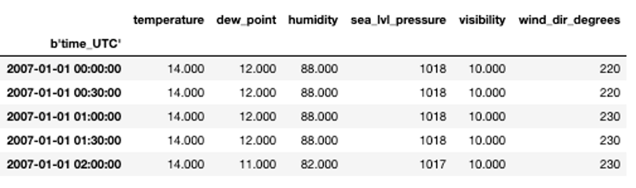
The dataset contains the outside temperature and the dew point in degrees Celsius, the air humidity in percentage, the pressure at sea level in hPa, the visibility in km and the wind direction expressed in degrees. The weather data is measured by a set of connected sensors. For these, it is rare that the data availability is uninterrupted for such a long period.
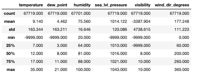
For this reason, we first check the general statistics for the data set. For most variables, the minimal value is -9999, which indicates missing values as also specified in the documentation of the data. We will replace these with so-called ‘Not a Number’ values or NaNs such that they will not interfere too much during data modelling.
In a next step, we fuse the electricity data and the weather data. Note, that the temporal resolution of the two is not the same – the power data is measured every minute while the weather information is available only every 30 minutes. The integration of these two datasets thus requires careful consideration.
Two options are possible: we can either upsample the weather data or downsample the household data. That means that we either linearly interpolate the information from weather data on a one-minute interval or aggregate the power data on bigger intervals. In this use case, the latter is more reasonable, as otherwise, we would need to find a way to impute missing data in the climate dataset.
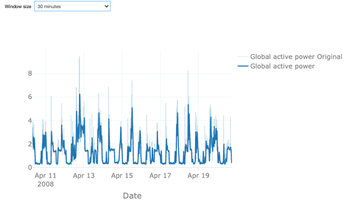
Let us first analyze the effect of downsampling the power data. Therefore, we calculate the rolling mean values of the original power over a given time window. You can choose between a sampling rate of 30 or 60 minutes, or 4 hours. The light blue time series shows the original data, the dark blue one the downsampled one. In all cases, the data looks smoother as the original data, as taking the mean value smooths out the major short-time power peaks but at the same time results in some loss of information. With the larger window size of 60 minutes this effect is stronger than for the smaller one. A window size of 4 hours arguably removes too much variation. Note that the weather data is available every 30 minutes such that in case of an hourly time window for the power data also the weather data has to be resampled. Since the information loss for the 60-minute interval is reasonable, we decide to proceed with this sampling rate. This also allows us to reduce the size of the dataset, which will reduce the computation time required for the analysis.

In order to merge the two data sets, we transform the active power from a minutes-based power measurement given in kW to an hourly consumption given in Wh. Therefore, we sum the power over one hour and divide it by 60 to get the actual energy. By additionally multiplying by a factor of 1000, we change units from kWh to Wh.
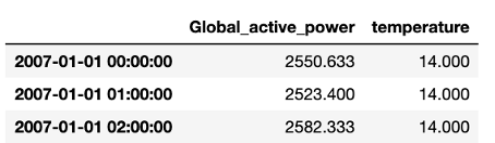
For the weather data, we proceed similarly by taking the mean temperature over one hour. With this, we can join the two data sets. For future analysis, we will only take the global consumption and temperature into account.
Now that we have preprocessed the dataset, we will illustrate how to gain deeper insights in the data through both visual and statistical data exploration. In the next video, we will start with the visual exploration by means of time plots.
Visual Data Exploration
Welcome to the third video of the tutorial for the AI Starter Kit on resource demand forecasting! Let us now explore the extended dataset in order to understand which factors influence the household energy consumption. Based on this exploration, we will later on identify which features are useful for training a machine learning model to forecast energy consumption.
Time plots are a common way for exploring time series data, such as the energy consumption that we consider here. We explore time plots in different time frames in order to highlight different seasonal patterns in the data.
We start with a yearly plot, which allows us to identify global patterns. Then, a monthly plot allows us to zoom in and understand relationships between energy consumption in different weeks and days along the year. And finally, a weekly plot allows us to zoom in even further and identify daily and hourly patterns.
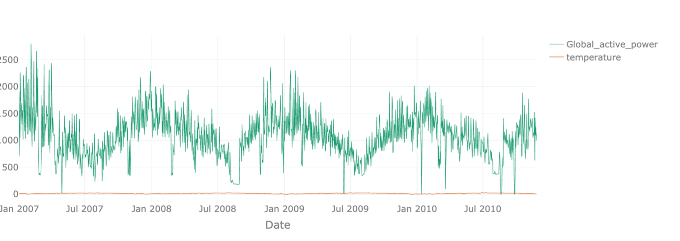
We start with the yearly plot. The data ranges from January 2007 to end of 2010. We can easily see the yearly pattern for the global active power with peaks in winter and valleys in summer. With these settings though, we see the temperature values only as a flat line because they are about two magnitudes smaller. When only displaying the temperature, we see a similar pattern with high values in summer and low values in winter, as expected. In order to make the two-time series comparable, we normalize the data, such that the maximal value of each time series corresponds to 1 and the lowest one corresponds to zero. Like this, we can see that the two show an opposite evolution over the year.
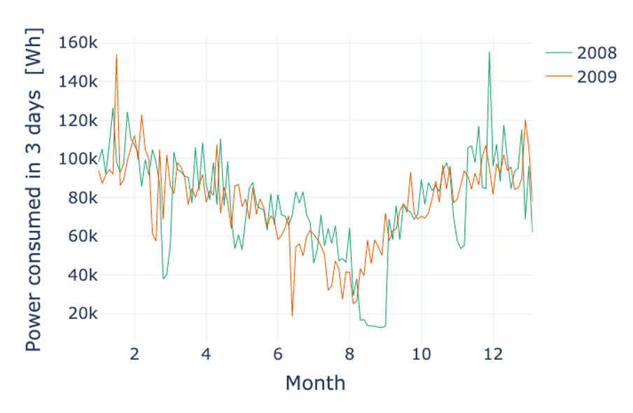
For the monthly data, we progress analogously. While we can again clearly see the annual effect, there is no clear pattern recurring every month. One interesting thing that can be observed is that strong dips in power consumption tend to happen at the same time in February and November in 2007 and 2008. Most likely, these are holidays which tend to happen at the same time for the household under investigation. This can be best seen when the sampling rate is changed. Instead of showing the data per day, we can have a look at the rolling mean of the active power over three days to see the pattern more clearly.
We further explore the evolution of the energy consumption in a shorter time frame. We want to verify whether during a week, the energy consumption exhibits the same patterns.
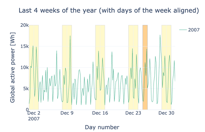
In the following plot, the user can inspect and compare the energy consumption in December of different years. We mark weekends in yellow and Christmas day in orange. What can you notice when you compare weekdays and weekends? And how about the holidays?
Exactly, the mean consumption is higher on the weekends. The reason might be that more members of the household are at home during the weekends. Comparing the week around Christmas 2008 and 2009 shows interesting patterns. While the household was obviously at home and maybe even with guests in 2009, it looks like they were not around in 2008 for several days.
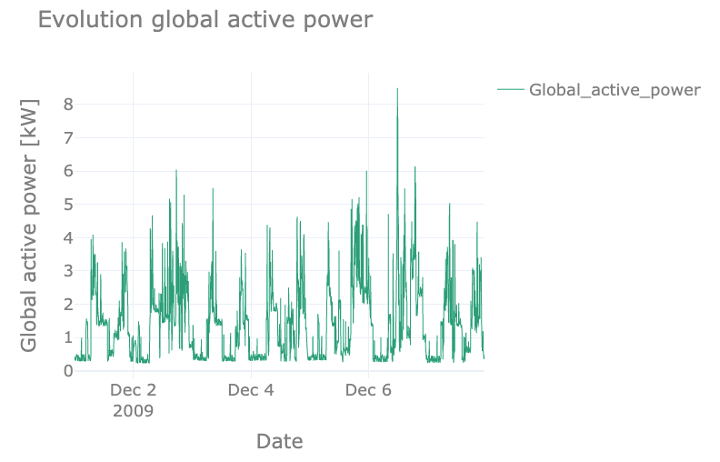
Finally, we analyze the daily pattern. For this, rather than showing the resampled dataset, we use the original dataset, which provides consumption with a sampling rate of 1 minute and which can show more detailed patterns. Note that this means we are using the original units of kW. In the figure, we see how the power consumption follows a daily recurring pattern, with peaks in the morning and evening and troughs at night and noon – on weekdays. The 5th of December was a Saturday, and we can clearly see how the curve of that day deviates from the weekdays.
During the night, we still see a low and more or less constant power usage, most likely due to appliances like refrigerators that run continuously.
In the next video, we will discuss the statistical significance of the patterns detected and prepare the data for machine learning modelling by extracting meaningful characteristics or features.
Statistical Data Exploration and Feature Engineering
In the former video, we performed a visual data exploration. We could already gain quite some insights from the figures we showed. In this video, we will concentrate stronger on statistics in order to verify our findings. Finally, we will prepare the datasets for modelling purposes by extracting a number of distinguishing features which will serve as input for the machine learning algorithm.
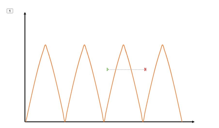
In order to find repetitive patterns in time series data, we can use autocorrelation. It provides the correlation between the time series and a delayed copy of itself. In case of a perfect periodicity as shown in the figure, the autocorrelation equals 1 if we delay one copy by the periodicity.
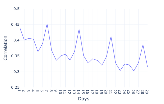
In order to investigate the autocorrelation in case of the global active power, we visualize the autocorrelation with time lags of 1 day, 2 days, and so on. Note that we do not show the results of a delay of 0 days, since the correlation with the exact same day would trivially be 1. For bigger delays, a clear peak occurs after 1 day, indicating the consumption of a day is highly correlated with the consumption of the previous day. And more obviously, several peaks occur every 7 days, which confirms the existence of a weekly pattern. That means that the consumption of a day is highly correlated with the consumption of the same day one or several weeks earlier.
In the data exploration video, we further saw that the temperature and the global active power show an opposite trend. In order to verify the strength of this relationship, we can compute the correlation between these two variables. For this purpose, we compute Pearson’s correlation.
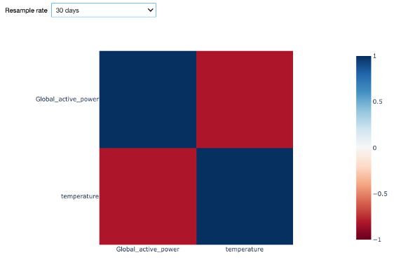
The Starter Kit allows to calculate the correlation between the temperature and the global active power for different resampling rates. Why is this important? One reason is the time scale for changes. The temperature typically changes less drastically over time than energy consumption does. In the figure, on the diagonal, we see the correlation of the two time series with each other, resulting in a perfect correlation of 1 as expected. On the opposite, along the antidiagonal, we see the correlation between the global active power and the outside temperature. In case of a sampling rate of 1 hour, the negative correlation is weak with roughly -0.2. With an increased resampling rate of 1 week, the negative correlation is more evident with a value of -0.75. This confirms our insight from the visual inspection. With a larger sampling rate, the short-term fluctuations – for example from your washing machine – are smoothed out and leaves us with the seasonal pattern.
From these insights, we can now start extracting features from the extended dataset that we can use later on for the electricity consumption forecasting. A feature is an individual measurable property of the phenomenon being observed. Choosing informative, discriminating, and independent features is a crucial step for building effective machine learning algorithms. Based on the previous visual and statistical observations, we will consider the following features to predict the energy consumption for the hour ahead:
- energy consumption of the day before because we saw that there was a peak in the autocorrelation with a delay of one day;
- energy consumption of the 7 days before due to the weekly pattern;
- the hour of the day, which will allow to distinguish between different periods of the day (i.e., night, morning, afternoon, evening);
- the day of the week, which will allow to distinguish between weekdays and weekend days
- whether the day is a holiday or not;
- the month of the year, which will allow to distinguish between yearly seasons; and finally,
- the temperature.
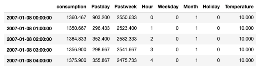
That results in the final dataset that will be used as input for the machine learning algorithm to learn the model.
Before discussing the modelling step in more detail, in the next video, we will provide a theoretical overview of the approaches chosen for the electricity consumption forecast.
Advanced Regression Models
Before deciding on the most appropriate algorithm to solve a particular data science problem, a first step is to decide which type of task you are trying to solve. In order to do so, you usually need to start with finding the answer to a number of questions, based on the case under consideration. Without a clear understanding of the use case, even the best data science model will not help.
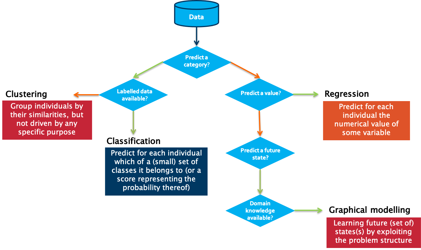
A first question to answer in that respect is which type of outcome is expected from the use case owner.
Is the aim to predict a category, such as ‘normal’, ‘degrading’ or ‘failed’?
If yes, the next question to answer is whether labelled data is available or not. Labelled data is data for which examples are available that are annotated by a domain expert with the classes to predict.
Put differently, for each data point or set of data points, a class is defined. Usually, the number of unique classes is rather small. This data will be used by the algorithm for training a model. Once trained, it can be evaluated on a test data set, for which the classes are known but will not be visible to the model. Evaluating the ratio of correctly predicted classes gives a measure of the quality of the model. Often used algorithms for classification are k-Nearest Neighbors, Decision Trees or Support Vector Machines.
But what can we do if we do not have information available on possible classes? In that case, introducing a similarity between the examples that you have available makes it possible to cluster different data points into groups. These groups can then be used to gain deeper insights into the data, and in some cases can be mapped to particular classes. Partitioning-based clustering, hierarchical clustering or density-based clustering are often used techniques for this purpose.
The situation is different in case a numerical value should be predicted. It is similar to the classification task, but the prediction range is continuous. For these so-called regression tasks, Ordinary Least Squares or Support Vector Regression are often used.
If the goal is neither to predict a class nor a numerical value, but rather a future state, one typically turns to graphical modelling algorithms in order to predict these states. These techniques also allow one to include the available background knowledge into the modelling process. Examples of graphical modelling techniques are Hidden Markov Models and Bayesian Networks.
To make the difference between the single categories a bit more clear, we discuss some examples:
In case no labelled data is available, clustering of data points can provide insights in different modes in the data. An example is performance benchmarking of industrial assets. Let’s assume the data to analyze comes from a wind turbine park. When looking at several measurements, like for example of the power curve, the wind speed, and the wind direction, we can identify different modes in which the single wind turbines are operating.
In contrast, assume that we are interested in the expected power production of a particular wind turbine in the following days for which we have a weather forecast. We can use this information as input variables for a regression model and therewith predict the power production.
If labels are attached to the gathered data, for example on the root cause of particular sensor failures, a classification algorithm can be used to train a model that is able to determine which fault is associated with a certain set of sensor readings.
With this knowledge, we can decide which type of algorithms is suitable for the forecasting of electricity consumption. Let us use the decision tree for this:
Do we want to predict a category?
No, right, we are looking for a continuous value. So, we go to the right. And yes, we need to predict a value. Therefore, it is a regression task we are facing here. The question we want to answer is precisely: How much electricity will be consumed in the next hour, taking into account historical information regarding the electricity consumption and the outside temperature?
There is a bunch of regression algorithms that can be used in various contexts. In our case, we have a comparably small feature set and all of them are numerical. Therefore, we will go for two commonly used algorithms for the prediction, namely Random Forest Regressors and Support Vector Regressors. We will introduce both algorithms in more detail in the remainder of this video.
Random Forest Regression
We start with Random Forest Regression. The base to build a random forest is a decision tree – which works similarly to the one we just used to determine which class of algorithms is suitable for the electricity forecasting. Since in a random forest, the model is defined by a combination of trees, it is a so-called ensemble method. Ensemble methods help improve machine learning results by combining several models. This approach allows the production of better predictive performance compared to a single model. From each decision tree a value is predicted, and the final prediction will be a weighted function of all predictions.
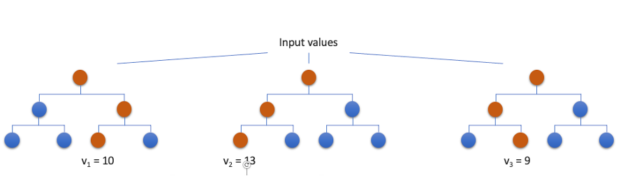
Here we see a very simplistic version of a random forest regressor with only three decision trees. All trees are trained in parallel and each one will predict a value for a given set of input variables. The final prediction in this case would be the mean value of all predictions, ergo 10,67.
In order to improve the performance of a model, you need to tune the algorithm’s hyperparameters. Hyperparameters can be considered as the algorithm’s settings, or put simply, the knobs that you can turn to gain a better result. These hyperparameters are tuned during the training phase by the data scientist. In the case of a random forest, the most important hyperparameters include the number of decision trees in the forest, the maximum depth of each of these trees, and the minimum number of examples and maximum number of features to consider when splitting an internal node in one of these trees.
Support Vector Regression
Another type of regression approach is support vector regression. While support vectors are mainly used in the field of classification, with some adaptions, it also works for regression tasks. It works similarly to an ordinary least squares regression where the linear regression line is targeted with the smallest overall deviation from the data points. This is very handy in case of linear dependencies and for clean data. But as soon as there are several outliers in the data set or the relation between the data points is non-linear, the quality of the model can decrease significantly. Especially in the context of industrial data, this can never be fully avoided. For Support Vector Regression a band of width epsilon ε is defined. We call that band the hyperplane. The aim is to search the hyperplane that includes most points while at the same time the sum of the distance of the outlying points may not exceed a given threshold. The training instances closest to the hyperplane that help define the margins are called Support Vectors.
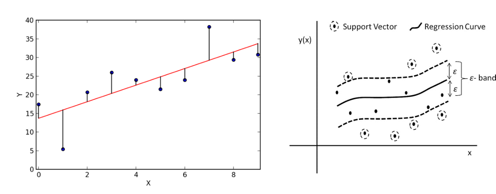
As for random forest regression, also support vector regression has a number of important hyperparameters that can be adjusted to optimize the performance. A first important hyperparameter is the choice for the type of kernel to use. A kernel is a set of mathematical functions that takes data as input and transform it into the required form. This kernel is used for finding a hyperplane in a higher dimensional space. The most widely used kernels include Linear, Non-Linear, Polynomial, Radial Basis Function (RBF) and Sigmoid. The selection of the type of kernel typically depends on the characteristics of the dataset. The cost parameter C tells the SVR optimization how much you want to avoid a wrong regression for each of the training examples. For large values of C, the optimization will choose a smaller-margin hyperplane if that hyperplane does a better job of getting all the training points predicted correctly, and vice versa. The size of this margin can be set by epsilon, which specifies the band within which no penalty is associated in the training loss function with points predicted within a distance epsilon from the actual value.
Now that we gained some more knowledge on these two frequently used regression approaches, in the next video we will explain how to train a regression model for our household energy consumption prediction problem.
Data Modelling and Forecasting
Now that we gained the necessary insights from the data, extracted a number of meaningful features, and gained some theoretical background on regression models, we will use the AI Starter Kit to discover the most important factors for training a machine learning model. More specifically, we will analyze the influence of the training strategy, type of machine learning model and effect of data normalization on the model performance.
To evaluate the performance of the models the mean absolute error or MAE is used - a metric commonly used in literature for this purpose. This metric quantifies to what extent the model forecasts are close to the real values. As the name suggests, the mean absolute error is an average of the absolute errors. It holds that the lower the MAE of the model, the better its performance.
As just mentioned, the training strategy, the machine learning model and the data normalization may influence the quality of the predictions. Before we start training a model, let us dive a bit deeper in these three influences.
First of all, let us turn to the training strategy. The training data typically highly influences quality of the model. Therefore, in this starter kit, we will experiment with six different training strategies, to study their influence on the quality of the resulting model.
First, we will use 1 month before the test month as training data. In the Starter Kit, several models are trained for the predictions of each individual month. Each model is trained on one month before the month we are making predictions for. A one-month gap is introduced between the training and the test month in order to avoid that the last day of the training set is also included in the first day of the test set. For example, the models that will make the predictions for April 2008 will be trained on the data from February 2008.
Secondly, we will use 6 months before the test month as training data. This is thus highly similar to the above experiment, but with 6 months of training data. It still includes a 1-month gap. Or we can go back even further in time and use 1 year before the test month as training data.
Similarly, we can use 1 month the year before as training data. This is similar to strategy number 1, but with a gap of 11 months. This way, the training data and test data are taken from the same month, one year apart.
Further, we can also use all months before the test month as training data. For each test month, a model is trained using all the data prior to this (including a 1-month gap). This strategy simulates the scenario where the model is retrained as new data comes in. Since this requires training several models based on potentially large training sets, this might require a certain computational time.
Finally, we experiment with training on the first year of data and make predictions on the rest. This strategy is commonly used for training these kinds of models.
With these training strategies, we will see how strongly the amount of data but also the seasonal pattern will influence the quality of the model.
As already introduced in the former video, we will train two different types of models, namely a Random Forest Regressor and a Support Vector Regressor. Besides these models, we will also use a simple benchmark model that we use to compare the performance of the models against. For the prediction of the energy of a certain day, this benchmark model simply takes the energy consumption of the previous day at the same time. Note that for this approach no model is built and consequently it does not include any training phase.
Finally, a short note on normalization. We saw already in the video on data understanding that the scale for the outside temperature and global active power are quite different. This is also true for the remaining features that we introduced. Therefore, it might be necessary to normalize the data, that is, rescale it such that all input and output values are between 0 and 1. This is indeed a requirement for the correct training of some machine learning models. We will test in the Starter Kit whether it makes a difference for the models suggested.
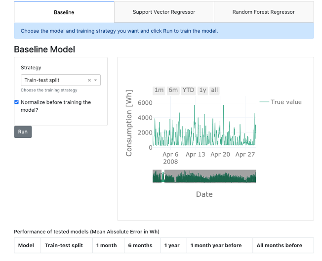
At first, let us run the baseline model as we will later on compare all model results to these results. The mean absolute error is 604.45. Putting this number into relation with the mean global active power of 1118, the error is comparably high. For reasons of comparability, each result will be shown in the table just below the interface.
As discussed above, we first want to analyze the influence of the training strategy. Therefore, we train the Support Vector Regressor on strategy 1, so for 1 month of data, and on strategy 2, for 6 months of data. In this first experiment, we will not normalize the data beforehand. For both strategy 1 and 2, the mean absolute error is even bigger than for the benchmark model. Therefore, we are going to use the normalized data instead. With that, the model predictions improve and for both strategies, this results in better forecasts than the baseline model. We can do the same for the Random Forest Regressor. We train if for both strategies – namely strategy 1 and 2 – and on the normalized and non-normalized data. In all four cases, the results are better than those obtained by both the baseline model and the Support Vector Regressor. Now it is up to you. Train different models and find out which model returns the best results and which influences are the strongest. If you want, you can pause the video for this.
These are the basic findings when training all models:
Concerning the training strategy, we see that for the Support Vector Regressor the standard train-test split has the best performance, although using all months and using a one-year window before the test month as training data both have a similar performance. Furthermore, we clearly see that using a one-year window before the test month as training data leads to better performance than the other training strategies. We note that for both this “one year window” strategy and the standard train-test split, the training data is one year. The difference, however, is that for the former the training set changes, while for the latter it is fixed meaning that all the data from 2017 is used.
A general trend that can be observed is that the performance increases as a larger training set is used. We therefore urge the user to look at the predictions made using the training strategy where all months before the test month are used as training data: we can expect that the predictions for the later months will be better than for the first months since more training data was used. However, this is hard to see by eye in the prediction plot directly.
Regarding the chosen model, we can see that both the Support Vector Regressor and Random Forest Regressor outperform the simple baseline we set up. Further, the Random Forest Regressor outperforms the Support Vector Regressor for all training strategies. This shows the importance of knowing which model is best suited for your problem and testing different ones. Important to note though, is that no extensive hyperparameter tuning was performed, which could alter this observation. This is required for a proper validation of the algorithms and therefore we encourage the user to also experiment with altering the hyperparameters and study the influence on the results.
Finally, normalizing the data, rescaling it such that the input and output variables all have values within a similar range - in this case, between 0 and 1 - is a common step when setting up machine learning models. This is because, depending on the model, they work much better with values of this order of magnitude. We see that normalization indeed greatly improves the predictions for the Support Vector Regressor but has little influence on the random forest regressor. Indeed, algorithms such as random forests and decision trees are not influenced by the scale of the input variables.
We hope that you have gained more insights on how the training strategy, the type of machine learning model and data normalization influence the model performance and are familiar now with the usage of the interface. We suggest that you try a number of additional combinations of settings and think about in which way they influence the quality of the model.
In the next video, we will summarize the key take away messages and provide you with a number of suggestions for additional experiments to gain additional insights.
Key Take Away Messages
In the video tutorial for this AI Starter Kit, we demonstrated forecasting the demand for a particular resource at a particular point in the future, illustrated on the case of energy demand forecasting. In doing so, we have taken you through the different steps in the data science workflow.
We first performed a number of required data preprocessing steps in order to prepare the data for further analysis. This included fusing the electricity and weather data, requiring to resampling the former data to a lower sampling rate.
Subsequently, we explored the fused dataset in order to better understand which factors influence the household energy consumption. To this end, we resorted to both visual and statistical exploration methods. Based on this, we could identify a number of yearly, weekly, and daily patterns, including particular behavior during weekends and some holiday periods. This information formed the basis for the feature extraction that followed next, such as the energy consumption a week before, the day of the week and the hour of the day.
Finally, we served the extracted features to two different models, namely Random Forest Regression and Support Vector Regression to perform the actual forecasting. Through different experiments, we analyzed the influence of the training strategy, type of machine learning model and effect of data normalization on the model performance. Based on this, it became clear that achieving good prediction results depends on different factors, including the appropriate data preprocessing, the amount of available training data and the algorithm parametrisation.
As next steps, we invite you to further explore each of these influences in more detail. Especially with respect to the hyperparameter tuning, it proves worth to further explore the different parameter settings and study how these changes impact the model performance. Furthermore, you can also try to adapt the different steps to the context of your own dataset.
While the details of each of the steps might differ, the methodological steps we presented are typically the required phases you need to go through when solving a resource demand forecasting problem.
We thank you for completing this video series and hope to welcome you in another AI Starter Kit tutorial.
Additional information
The video material in this website was developed in the context of the SKAIDive project, financially supported by the European Social Fund, the European Union and Flanders. For more information, please contact us at elucidatalab@sirris.be